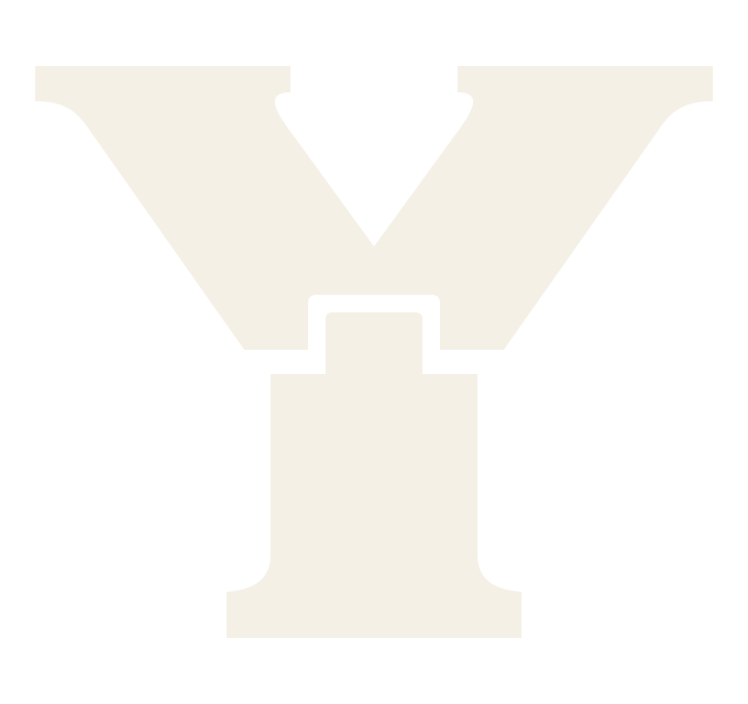
A Y built from two pieces.
The maker's mark for Yarb Works: part family initial, part woodworking joint, and a reminder of what happens when two people build together.
Why the Y?
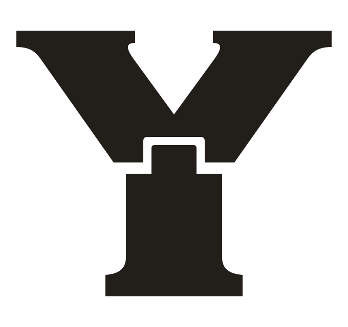
Y is where the Yarbrough name begins. The branches suggest growth, many interests, and many hands at work. The base is a foundation: family, craftsmanship, and useful things made to last.
The joint is the point.
We explored a solid rooted Y, split stems, dovetails, and other marks. We kept coming back to the subtle mortise-and-tenon detail: an upper piece seated onto a lower stem, with a small but deliberate seam.
The final shape keeps the tab broad enough to feel sturdy, gently softens the inside corners, and doesn't rely on shading to make the join read. It works as a single-color vector as well as a warm metal stamp.
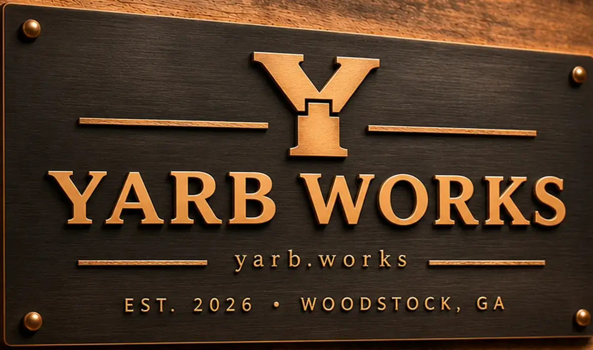
One mark, many places.
A tiny favicon, a branding iron, an engraved tool cabinet, the underside of a furniture build, or the top of this website. The same geometry runs through all of them.
Explore the design system